Designing and building a custom application is a multi-part, multi-party process. In my work, I am typically building the front end of a web or mobile application, and I am typically working from a static mockup created by a designer.
While mockups are an excellent tool, it can often be the case that the mockups are focused on a sort of “ideal state” in the application. There may be a number of edge cases not covered, especially if you’re dealing with a designer newer to UX, or if the project is under tight time constraints.
If you know what you’re looking for, you can spot and address these outliers before you start coding, saving you from getting stuck or breaking flow later in the process.
Layout
User-entered data: Too much or not enough content
Anywhere in a layout that is designed for user-entered data, you as the front-end engineer need to account for what that element looks like when there’s no content, too little content, or too much content.
No content: A good example of this is a user’s first time landing on a page that doesn’t have data yet. It’s likely up to you to think about what the most helpful thing to include on this page is; maybe a prompt or call to action for what the user should do to fill in the content, or a sensible placeholder to help users understand what should go there.
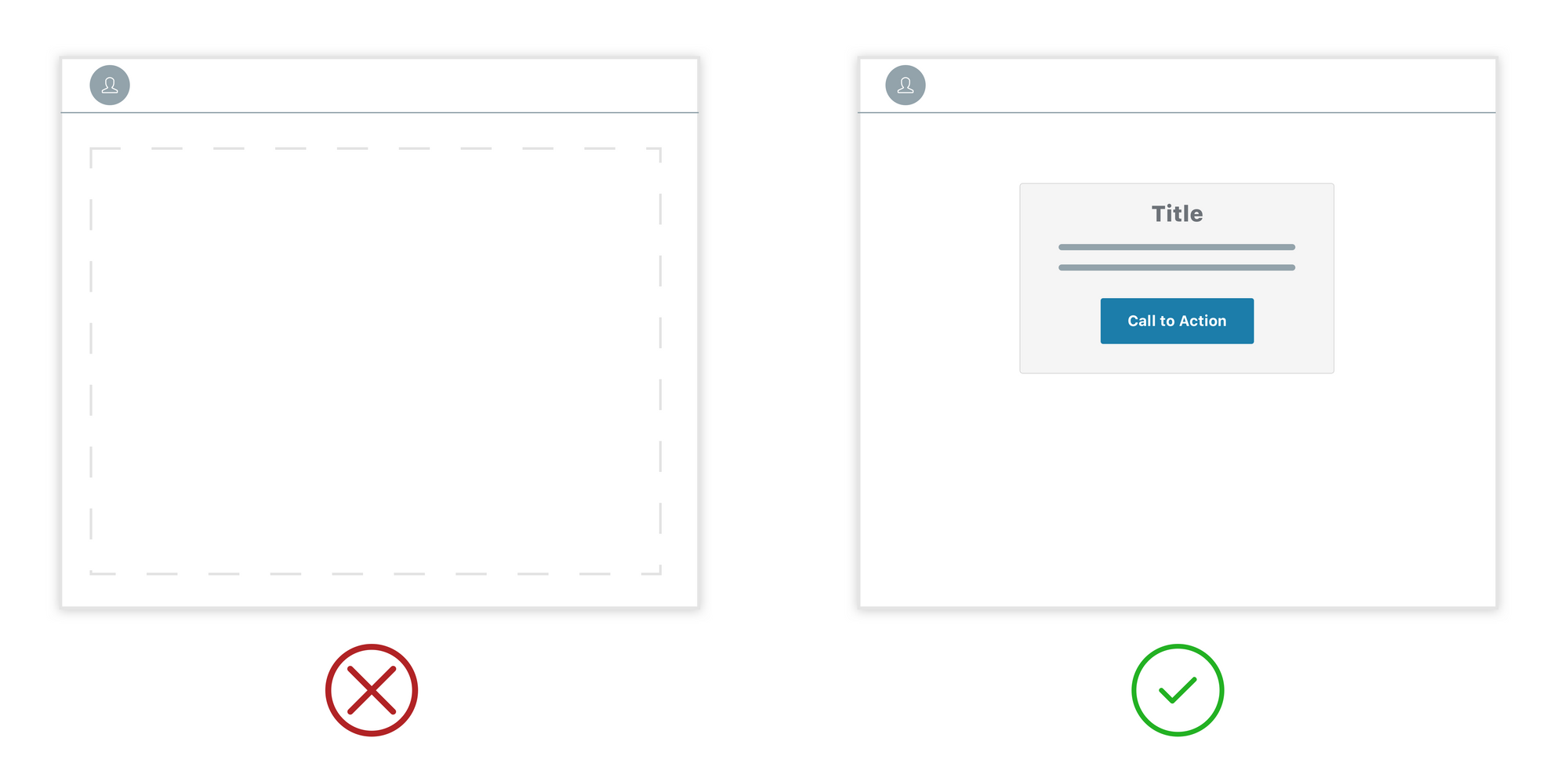
Default images: If your app uses avatars, what do you display before the user has set their image? There are a number of well-established patterns you can adopt (see Twitter or Google for two examples), it’s just important that you’ve got something there and not an empty hole in your layout.
Too much content: Testing for how your layout responds when user-filled content is much longer than expected is also important.
You can do a little bit of QA as you’re interacting with early versions of the UI. I am typically working without seed data anyway, and one easy way to test out these edge cases is to create them. What does your UI look like with no content? Super short content? Way too long content? Do you need to truncate or provide a character limit? Even with a character limit, not all characters are the same width — ten capital Ws are much wider than ten lowercase ls.
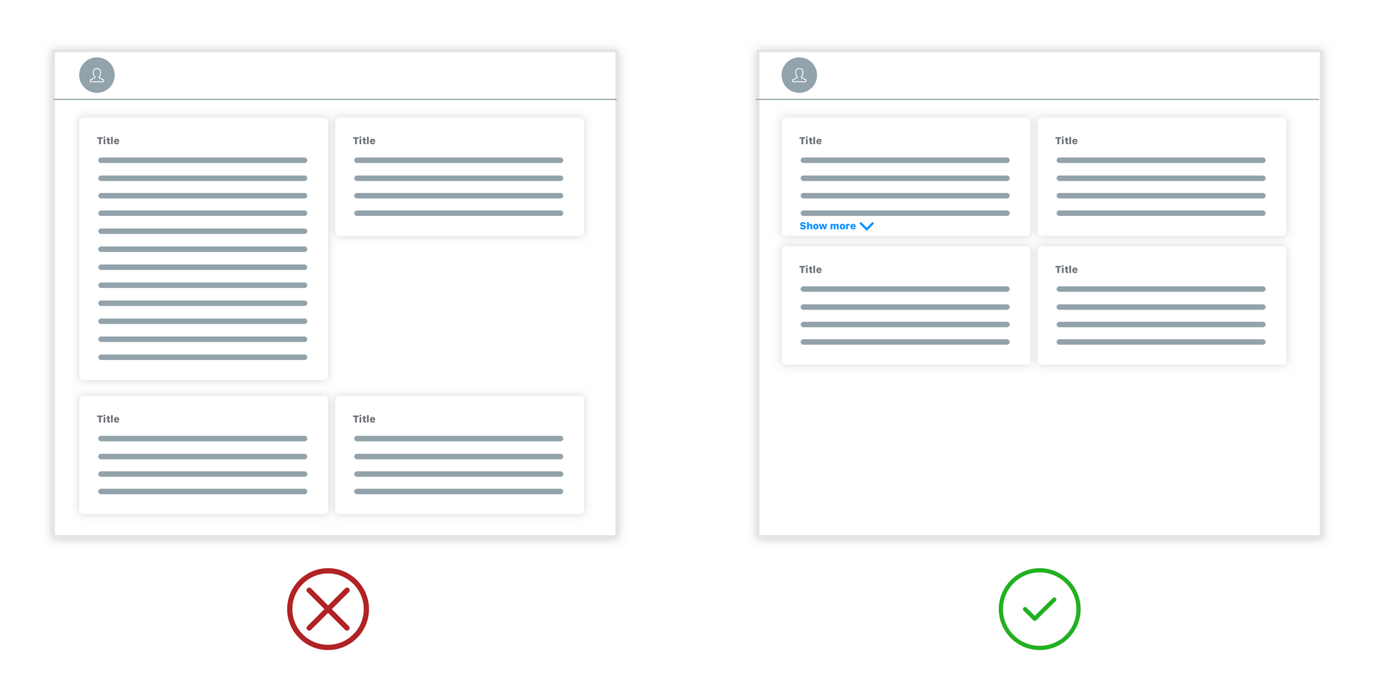
Grids, alignment, and unexpected overlaps
Unexpected overlaps: In a responsive app with user-filled content, sometimes content and containers end up overlapping in unexpected ways. For instance, in an app with a two-toned background, it might look perfectly great when the top element is ideally sized. But when the top element has less content than expected, the next container ends up overlapping with a different less-contrasting part of the background, creating an accessibility issue.
How many elements in your grid: How many elements is ideal in your grid layout, and how does the layout respond when it has a non-ideal set? In a 3X grid, what does the layout look like when you have five elements? The mockup you’re working from is unlikely to include this scenario, but it’s still important to consider how the spacing will work, and to make sure the layout still looks good in all cases.
Alignment and variable-length fields: Designers tend to drop in placeholder text that is the same length everywhere; users are unlikely to be so consistent. Anything that looks aligned in a mockup but that follows a field that users can fill in is probably not going to look as good in practice as it does in the mockup.
Desktop vs mobile elements: How many and in what order
If you’re building a responsive app, you probably have at least two views for each screen, one that shows a desktop view, and one that shows a mobile view.
Order of elements: Sometimes interface elements appear in a different order in the desktop and mobile mockups; some reordering is definitely possible (through clever hiding or other tricks) but too much reordering can get messy and in some cases does not make sense. It’s better to clear up order mismatches in advance where you can.
How many elements fit: Ten nav elements may fit easily into your desktop interface, but if the mobile nav design only really has space for three, then you are constrained by the limitations of the mobile design, if you want both interfaces to provide access to all options. If you want to be able to add more nav elements in the future, your mobile nav design will need additional considerations.
Interaction states
Most of the mockups I work with are static, meaning that they do not include interactions or animations. That said, as the front end developer, you’re still responsible for making sure that they look and feel good, and match the style of the app.
Transitions and hover states
These aren’t so much a thing to look out for as much as a thing to remember to make thoughtful choices about; use sensible defaults, and consider how the transitions and animations you’re using fit with the look and feel of the interface. How long should animations be? How much ease should be included? Should elements fade or slide, what kind of transition best fits the app? How do buttons indicate hover and click state? All of these details contribute to a cohesive and satisfying user experience.
Scrolling states
When you have content that scrolls or moves, how do you make sure it’s clear to the user that the content is interactive? It’s important to make sure the design doesn’t create false floors and that the user has cues to let them know there’s more content to see.
New vs saved state
In some cases, you’ll find yourself with clear step-by-step mockups of creating content, let’s say, saving a credit card for future use, but without mockups of what the interface looks like when that data is already saved. Typically interaction flows show the case where nothing has been entered yet; as the front end engineer you still have to account for cases where the flow already has data in it.
You may not really even need a full mockup to articulate what this other state needs to look like; a note on what the client or designer was imagining could be enough, or a little mockup of the component / widget could also be enough in some cases.
Other common oversights
Design inconsistencies between similar screen types
Depending on how the designer was working and iterating, it’s possible that inconsistencies will have crept in by the time the mockups are final.
Sometimes a similar layout will be styled differently in the same set of mockups; if you catch this ahead of time you can talk with the designer and the customer about why the designs vary, and whether they can be brought into line with each other.
Otherwise, mismatched screens or extra layout styles will generate additional decisions that you’ll need to make while you’re implementing, pulling you out of coding back into design thinking and decision-making mid-stream.
Ideally, the app design will be a modular, consistent set of styles that are applied across the app. This consistency is efficient both in design and code, and a consistent UI will make your interface easier for users to learn and navigate.
Fonts
Typically the designer will give you a font. It’s definitely better to have the font up front; changing fonts mid-process can be a pain, as fonts vary dramatically in terms of size, proportion, and readability at the same point value. A more flexible design can sometimes accommodate font changes, but I wouldn’t count on it being easy.
Ideally you’ll get a handoff of fonts and sizes, but static sizes will only get you so far; converting to rems and handling zoom levels means that the sizes are useful but in many cases are just a starting place.
Error states
Mockups are typically built around ideal-case scenarios, and as such, error states are often overlooked. A humane, consistently styled error dialog goes a long way toward giving the user a unified, polished experience even when things aren’t working as intended. For the love of all that is good, don’t dump your users into an unstyled experience when things go wrong; that just makes a bad experience worse.
Put yourself in the user’s shoes
Next time you start a new front end project, check your mockups to see if any of these edge cases are unaccounted for. If you do spot some outliers, you’ll have the opportunity to ask the designer and customer questions that will help you know what direction to go before you start coding.
When you do find yourself missing details mid-stream, my advice is:
- Use reasonable defaults.
- Keep it simple.
- Put yourself in the position of a user and ask yourself what would be the most helpful thing.
It can be hard to step back from the coding process, but it’s super valuable when you find yourself in this situation. Thinking about what the user is trying to accomplish will help you make decisions that add to a great user experience. It can also be really helpful to get other people to poke around with a design-in-progress; fresh eyes will often catch things you can’t.
It’s inevitable that some questions will come up as part of your build process; you can never account for every detail in advance, especially in an agile development setting where iteration is the norm. But seeing some of these commonly overlooked considerations coming ahead of time will save you time and help you to avoid rework and breaking flow further down the line.
Header photo by Kevin Jarrett on Unsplash