Today, 60% of web browsing occurs on mobile devices, nearly doubling 31% from 2015. Web developers should implement responsive web design for various screen sizes. Luckily, decades of improvements to HTML & CSS make implementation straightforward. We have several tools for improving the responsiveness of our products.
With Tailwind CSS as the default styling framework for Phoenix applications, we can build components and layouts to meet user needs. But how can we test a responsive web design for various devices?
In this article, I'll walk you through two tools to test the responsiveness of your application.
The first option is built-in to your browser: Developer Tools
Developer Tools
In any modern browser, you have tools to debug, monitor, and analyze the front end of your web applications.
For this walkthrough, I'll use Chrome on MacOS. On your browser and operating system, some shortcuts and features may differ, but modern browsers have some version of this tooling.
On a Mac, Command + Option + I opens DevTools. I'll use our very own smartlogic.io as an example.
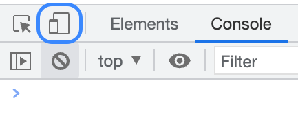
Comprehensive coverage of DevTools would require several articles. For now, let's focus on a responsive web design tool called the Device Toolbar
The Device Toolbar
To toggle the Device Toolbar, click the icon of a phone in front of a larger device. You may also use the `Command + Shift + M` shortcut.
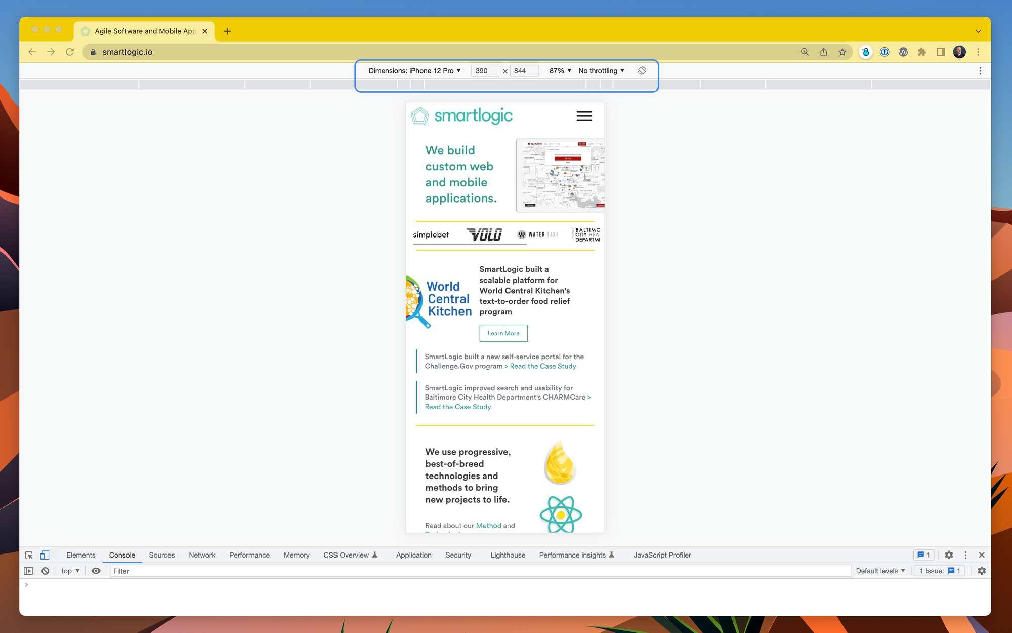
When you toggle the device toolbar, a menu appears below the browser's address bar:
One of the most fun and brutal things you can do to a page is open it in responsive mode. I've spent hours squishing and expanding app viewports to refine styling.
With the device toolbar, you can select from a dropdown of example devices. This dropdown allows you to mimic screen dimensions for various devices.
Responsive mode enables you to freely reshape the viewport.
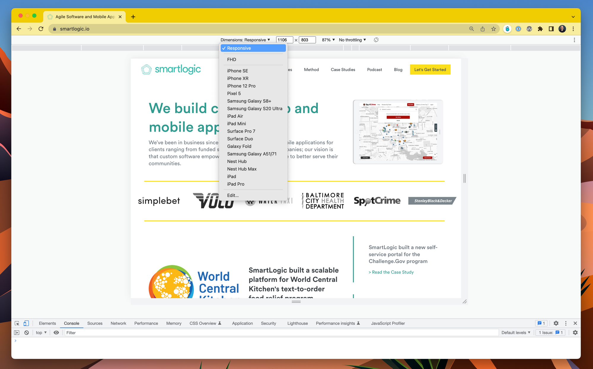
With Responsive selected, you'll notice handles on the page's outer edges. I'll demonstrate with a video:
Responsive Mode in Action
The layout adjusts the content to fit the screen as the viewport shrinks and expands. This highly responsive web design is the result of collaboration between designers and developers at SmartLogic.
Beyond Developer Tools
In-browser developer tools allow you to check a page's responsiveness but don’t tell the full story. On mobile, the layout may render differently. There may also be inconsistencies between features on mobile and desktop browsers.
Viewing a web app on a real mobile device will give you a better idea of how it responds in actuality. This is especially true when the web app relies on browser APIs.
How to Access Phoenix on Your Phone
To get started, you'll need:
- Laptop running a Phoenix application
- Local, secure Wi-Fi network (or lightning cable)
- Mobile device
Odds are, you already have all of these. Great!
Out of the box, Phoenix configures the endpoint IP to disallow network access. This is intentional. When you allow access from your phone, you allow access from any device on the network.
At home, you typically have control over the network. But, bad actors can connect to any public network and harm your app if it's exposed. So, proceed with caution when working on a public network.
Let’s assume you’re connected to a secure and trusted network.
Exposure
To make the server accessible to devices on the network, you need to make a change to config/dev.exs
config :my_app, MyAppWeb.Endpoint,
—-  http: [ip: {127, 0, 0, 1}, port: 4000],
++  http: [ip: {0, 0, 0, 0}, port: 4000],
...
In the example, The IP address 127.0.0.1 is called the IPv4 loopback address. It makes the server accessible only to the machine where it's running. When you change the IP to 0.0.0.0, you make the endpoint available to any device on the network. With the port unchanged, you can reach the site at localhost:4000 on the same machine.
But, what about your phone?
MacOS uses a service called Bonjour, for network device discovery. You don't need to know your host machine's public IP address to access the Phoenix server. Instead, you can use a URL like my-computer.local:4000, which is easier to remember.
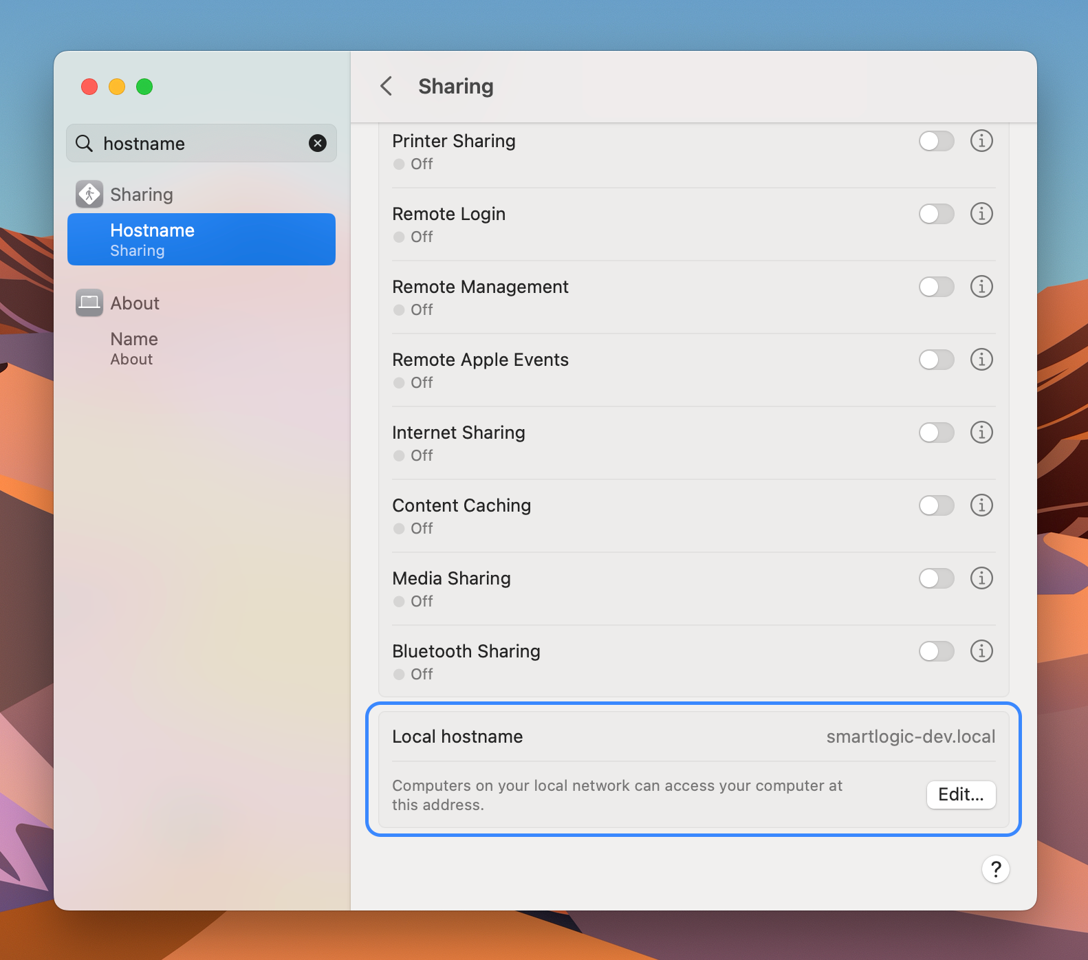
Naming Your Local Host
To find or change your Mac's local hostname, open Settings > General > Sharing (in MacOS Ventura) or search for "Sharing" in Spotlight Search. The default is typically your first name and the computer model.
I suggest modifying the hostname to something easier to type and remember. You may leave your hostname unchanged or enter whatever you prefer. For this example, I'll usesmartlogic-dev.local.
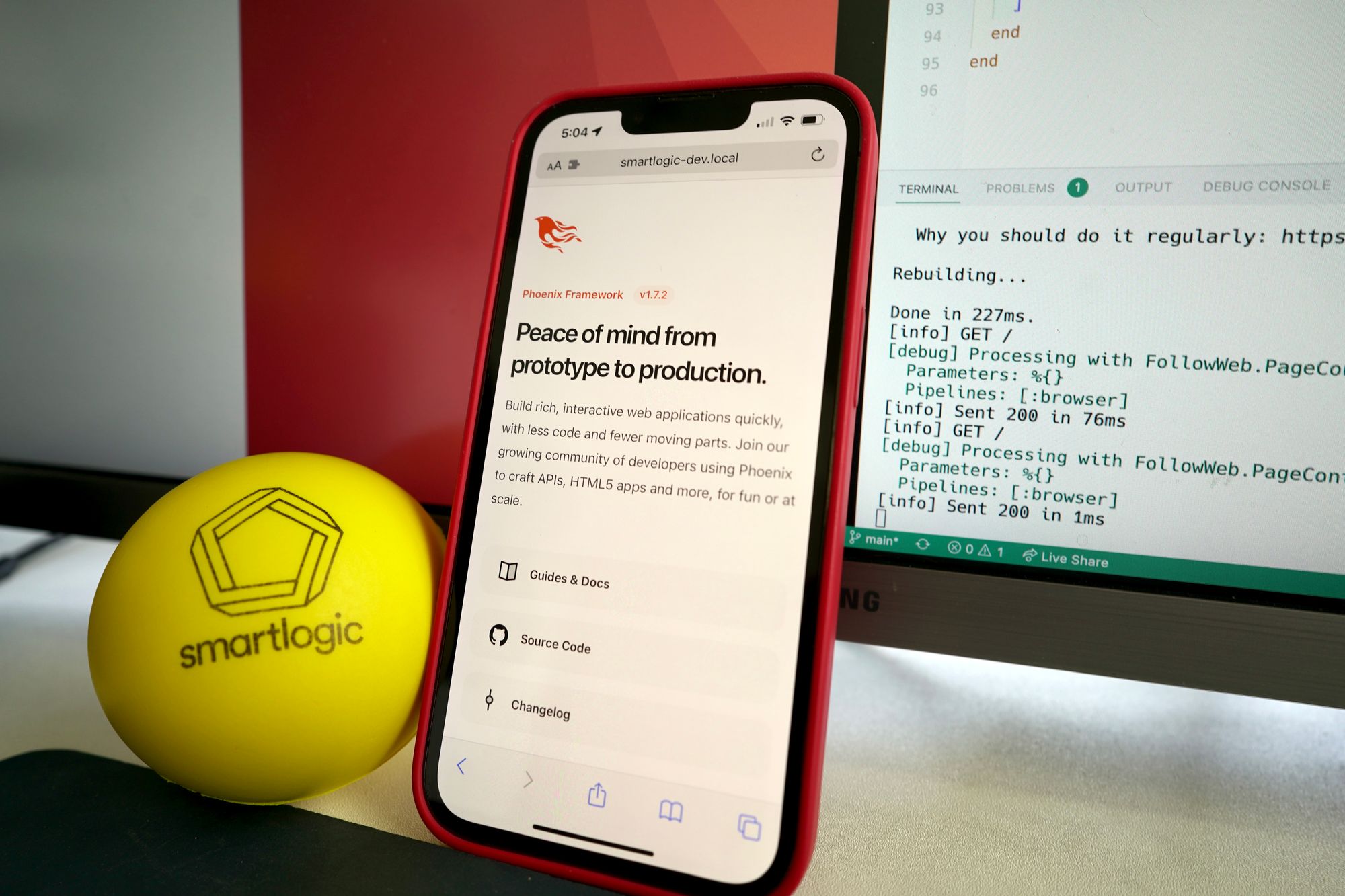
Voila!
Once you update the Phoenix Endpoint IP and find the local hostname, you can start the server and view the application on mobile devices. Remember, the port is `4000` in development, so, in this example, I'll open smartlogic-dev.local:4000.
What’s Next
With the Phoenix server exposed to the local network, you can simultaneously watch changes to layout on desktop and mobile devices. No external services or complicated configurations are necessary.
Local connectivity is great for developers and designers who need to support several device viewports. You can connect several devices to check responsive web design at a glance across devices.
Remember, use the loopback address if you're not on a trusted network.
While it’s out of scope for this article, I recommend reading the Responsive Web Design guides from Tailwind CSS and Mozilla Developer Network for more information on implementing layouts that work well across devices.
Thank you for reading and happy coding!