The recent launch of Phoenix 1.7 introduced a set of component-based generators for phx.new projects. The generators include a range of core TailwindCSS UI components with the core_components.ex file. One of these components is a modal, which developers can easily configure to match their application's style. Despite the usefulness of these core components, there wasn't much information available during the first week of launch.
Core components are easy to configure, saving time and increasing productivity. In this post, I’ll walk you through the steps to build a modal in LiveView.
What I Learned
Building a modal in LiveView was a new experience. Previously, I had only built modals using the traditional style with .heex HTML templates (Deadviews). Each core component in Phoenix 1.7 comes with various slots and attributes that you can use to customize the component. For example, the modal component has a show boolean attribute that controls its hidden state. Additionally, it has pre-built methods for handling events like confirm, cancel, show, and closing the modal. You can find these methods in the core_components.ex file when you create a new Phoenix app using phoenix.new in 1.7.
Why It's Useful
The core components that come with Phoenix 1.7, such as the modal, are useful for developers because they save time, increase productivity, and enhance the tooling available in the framework. These components can be easily configured using TailwindCSS classes or other styling libraries, such as Bootstrap. Access to these components straight out of the box streamlines the development process.
Understanding Core Components
Core components like the modal are designed to adapt easily to your project's requirements. By utilizing these components, developers can create a consistent user experience across different parts of their applications. These highly customizable components allow you to modify appearance and behavior to better suit your needs.
Working with Slots and Attributes
To effectively work with core components, it's essential to understand how slots and attributes function. Slots provide a way to inject content into specific areas of a component, while attributes allow you to configure the component's behavior. You can create highly dynamic components that adapt to your application's requirements by leveraging slots and attributes.
Use Case at SmartLogic
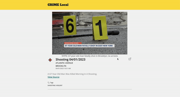
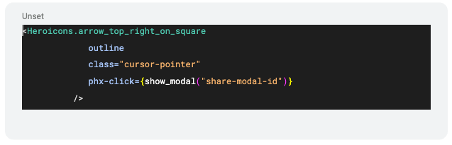
At SmartLogic, we needed to build a modal that allowed users to share content from our application to external social media platforms like LinkedIn, Facebook, and Twitter. To accomplish this, we used the new Heroicon functional component in Tailwind. To handle user interactions, we placed a phx-click event handler on the Heroicon and passed the show_modal function with the modal ID as the parameter.
The icon is set up with a click event handler that triggers the modal to display when the user clicks on it. Users can close the modal by pressing the “x” in the top right corner or clicking out of the modal– this comes out of the box with Phoenix 1.7.
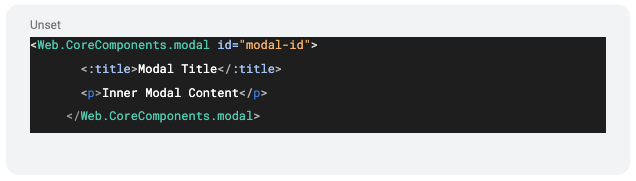
We then utilized the core component slots, such as :title, to render the header title for the modal and the inner block content below.
This implementation worked seamlessly and provided a smooth user experience.
A Deep Dive into Phoenix 1.7 Core Components
Tables
Tables are a common requirement in most applications, and with Phoenix 1.7's core components, developers can easily create responsive and customizable tables. You can style tables using TailwindCSS classes or other styling libraries and make them sortable or filterable depending on your application's needs.
Forms
Forms are essential in gathering user input, and Phoenix 1.7 makes it easy for developers to create and customize forms. With core components, developers can build forms with various input types, validation rules, and submit actions. You can easily style forms to match your application's design, ensuring a consistent user experience.
Data Lists
Data lists are useful for displaying a collection of items in a structured manner. Phoenix 1.7 core components allow developers to create customizable data lists that can be styled and configured to suit their application's requirements. This allows for a consistent and polished appearance across different parts of the application.
Authentication System
Phoenix 1.7's integrated authentication system makes it easier for developers to secure their applications. The authentication system includes features like user registration, login, password reset, and email confirmation. By leveraging the core components, you can quickly set up a secure and functional authentication system for your application.
Final Thoughts
Once we became familiar with the core components in Phoenix 1.7, we found converting designs from Figma mockups to production easier. The potential for further enhancements and additions to the Phoenix framework is exciting, and we look forward to exploring more of its features and capabilities.
The core components of Phoenix 1.7, such as the modal, are valuable to the framework. They simplify the development process, save time, and maximize productivity for Elixir developers. By following this guide, you'll be well on your way to building modals and leveraging the full power of Phoenix 1.7.